Search Results
You Searched For: Booksellers = Antikvariat Morris
1963 Results Found
Antikvariat Morris
mor5206
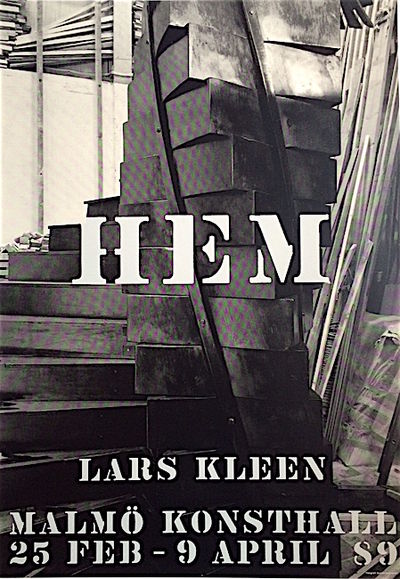
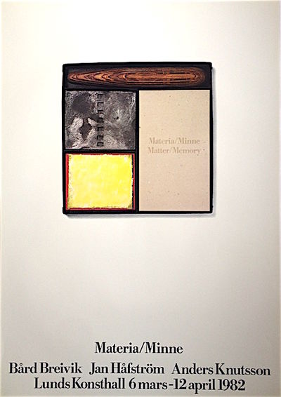
Malmö Konsthall. 1989. Screentryckt affisch. (70 x 100 cm). Foto: Gunnar Smoliansky. Formgiven av John Melin (Screentryckt form s. 34).
Antikvariat Morris
mor28094
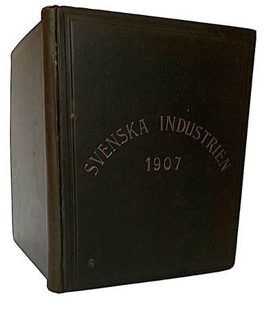
AB Svenska Industrien, Centraltryckeriet, Stockholm. 1906. Första årgången. (6), 448 s. + annonsavdelning 16 s. Dekorerat klotband. Aningen nötta pärmar. Med värdefulla uppgifter om tillverkning, varor, försäljning, ägarlängder, omsättning, anställda, adresser och mycket mer. Med ett omfattande register.
Antikvariat Morris
mor4555
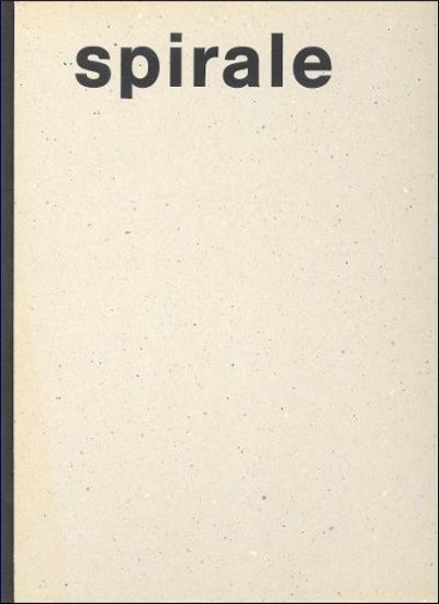
Verlag Lars Müller, Baden. 1990. 223, (1) pages. 4to (30 x 22,5 cm). Black cloth spine with thick card boards. The transparent printed jacket torn and worn. Name of the previous owner in ink on half title (Lars Hall). Profusely illustrated in colour and monochrome. Text in German. First edition.
Spirale was an international artists’ magazine for young art and is now one of the most important records of how art developed in the 50s. It marks the change of generations in post-war art and documents the development of abstract and constructive/concrete art in Europe. The Spirale was edited by Marcel Wyss, Dieter Roth, and Eugen Gromringer, other contributors were Max Bill, Richard Paul Lohse, Karl Gerstner, Mr Bremer, Helmut Heissenbuttel and other.
More info
Antikvariat Morris
mor5801
Libanus Press, Marlborough, Wiltshire. 2005. 434 pp. 4to (23,5 x 18,5 cm). Soft cover with folding flaps. Signed by Michael Mitchell & Susan Wightman. With over 1000 examples, illustrations and diagrams.
”Book Typography: A Designer's Manual” is a comprehensive guide to typography and typesetting. Books depend on good design to communicate. Every type of book, from a poetry collection to an encyclopedia, has its own style of communication. This manual describes the principles of good design, why they exist, and how to put them to practice.
”Book Typography” leads the reader from an understanding of what is a readable text, through the construction of books through all their different forms - novels, illustrated books and complex reference works. The organization of text and the handling of images are explained in detail. Advice is also given on work progression and print management.
Designing books is a visual task and is best demonstrated with visual examples. ”Book Typography” contains over a thousand examples and illustrations showing typographic principles put into practice - from the smallest detail of punctuation to flat plans of entire books. All the samples come from published works and each is labeled with the font used, its size and leading. Additional information and comment is provided in the side notes.
”Book Typography” defines the industry's technical terminology in the chapter, "The Basic Terms of the Trade". An extensive glossary is also included. It is an essential guide for students and recent graduates hoping to work in book design and publishing.
”Book Typography” covers every aspect of the book designer's task, providing an invaluable reference to editors, copy-editors, proofreaders, production managers and publishers.
More info
Antikvariat Morris
mor5237
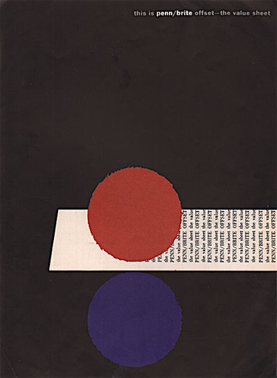
New York and Penn Pulp and Paper Manufacturers. No date (c. 1959-61). Mini poster, litograph-offset (30,5 x 22,2 cm). Lower left corner with foldmark. Trade advertisements: one-page two-sided full colour promotion on Penn/Brite paper. Very rare.
”These advertisements for Penn/Brite Offset paper are joyful examples of graphic style.” Steven Heller.
Henry Wolf (1925-2005) was an Austrian-born, American graphic designer, photographer and art director. He influenced and energized magazine design during the 1950s and 1960s with his bold layouts, elegant typography, and whimsical cover photographs while serving as art director at Esquire, Bazaar, and Show magazines. Wolf opened his own photography studio, Henry Wolf Productions, in 1971, while also teaching magazine design and photography classes. In 1976 Wolf was awarded the American Institute of Graphic Arts Medal for Lifetime Achievement, and in 1980 he was inducted into the Art Directors Club Hall of Fame.
More info
Antikvariat Morris
mor1910
Cambridge University Press, Cambridge. 1932. xii, 335 s. + 6 planscher, varav en utvikbar. Stor 4:o. Tegelfärgat och gulddekorerat klotband. Början, slutet och snitten med lagerfärgade prickar. Planscher och 156 fototypier.
En utvidgning av ‘The Sandars Lectures in Bibliography 1931–32’. Första historiken om den engelska dagstidningen. The English Newspaper är första boken som trycktes med Monotype Bell. (Appleton 120)
Antikvariat Morris
mor5615
The Whittington Press, Andoversford. 1983. (8), 49 pages + colophon. Small 4to (25,5 x 26,5 cm). Quarter bound by Smith Settle in brown cloth with Whittington marbled paper over boards printed spine label. 345 copies total, this is one of 250 copies (this is no. 17) printed on Sommerville laid paper. Signed by Edward Craig. Tipped-in frontispiece plate. Two wood engravings by John Craig and two by Edward Gordon Craig. (Butcher 65).
Antikvariat Morris
mor5477
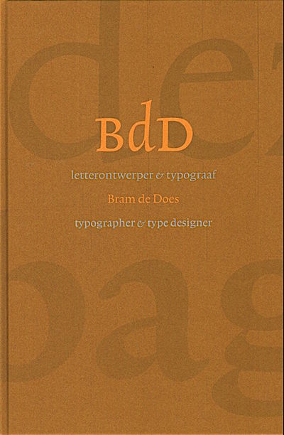
De Buitenkant, Amsterdam. 2003. 255 pages + colophon. Card boards. Illustrated in colour and b/w, 1 fold out specimen sheet. New copy.
Bram de Does (19 July, 1934 – 28 December, 2015) was a graphic and type designer. De Does studied at the Amsterdamse Grafische School in the 1950s. De Does came into contact with the printing trade at an early age, as his father had a printing office in the east of Amsterdam. From 1958 to 1988 he worked, with several intervals, at Joh. Enschedé, a printing office in Haarlem. He worked there primarily as a book designer. One of the most perfected is the book Typefoundries in the Netherlands. It was published in 1978, and is a prime example of fine Dutch printing and publishing. Incidentally, it was also the last book Enschedé published that was printed entirely by letterpress. De Does is known for his attention for detail and perfectionism for the Typefoundries in the Netherlands, he personally supervised the production of the paper (produced with his own recipe) and he insisted that the book should be printed by one person in a specially equipped room. De Does designed Trinité and Lexicon, two useful typefaces.
More info
Antikvariat Morris
mor28133
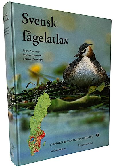
Sveriges Ornitologiska Förening, ArtDatabanken (Sveriges lantbruksuniversitet), Ekologiska institutionen (Lunds universitet). 552 s. (31,5 x 24 cm). Kartonnageband med tryckta pärmar. Kartor, fotografier, vinjetter och andra illustrationer, huvudsakligen i färg. Innehållsförteckning: Förord av Jens Wahlstedt, Sveriges Ornitologiska Förening 6. Förord av Torleif Ingelög, ArtDatabanken 7. Inledning 9. Artkartor och arttexter 22. Registrerade arter i alfabetisk ordning 536. Registrerade arter i antalsordning 541. Tillfälliga häckfåglar 546. Artregister, svenska namn 549. Artregister, vetenskapliga namn 550. Vår Fågelvärd, supplement nr 31, Stockholm. Mycket fint skick!
More info
Antikvariat Morris
mor28138
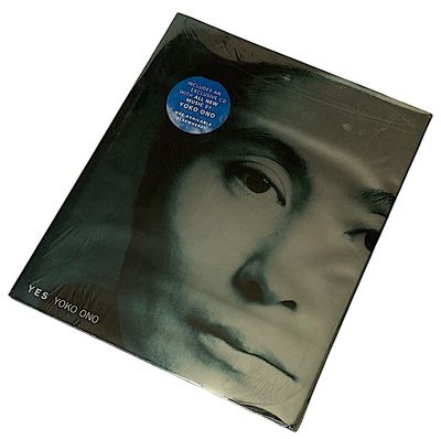
Japan Society / Abrams, New York. 2000. 352 pages (30,5 x 26 cm).A Very Fine copy in black linen cloth over thick boards, in a Very fine metallic blue and silver frenchfold dustwrapper. Still in shrink wrapps. With CD inside envelope tucked into rear endpaper. 287 illustrations, 102 in colour. A full-scale large format monograph on the artist's works over time, with documentary essays by several hands.
Antikvariat Morris
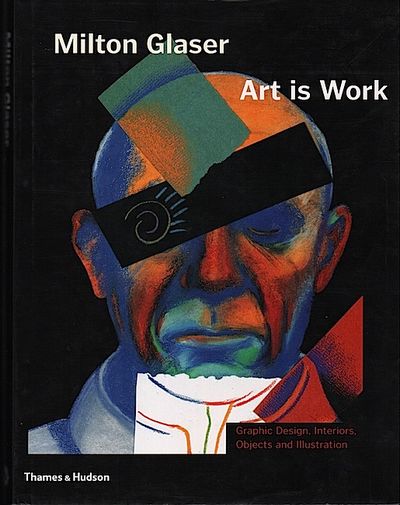
mor4991
Thames & Hudson, London. 2000. 272 pages. Tall 4to (33,5 x 26 cm) Fine black stamped cloth boards in like dust jacket. Over 500 colour illustrations. First edition. ”Graphic Design, Interiors, Objects and Illustrations” = cover title.
”Art is Work is a lavishly illustrated overview of Glaser’s rich and prolific output of the last twenty-five years, from newspaper, magazine and book designs to posters, toys, corporate identity and CD covers.”
Antikvariat Morris
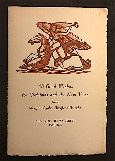
mor5400
An original Christmas card with a two-colour abstract engraving of a female figure. No date, but from the 1930s when they lived in Paris. 8vo (20,5 x 23,5 cm). Folded once. Top edge cut. Inscribed on front cover with pencil ”J.v.K.” [Jan van Krimpen].
JBW was one to hop on and off the train, experimenting with abstract or surreal styles, while not adopting wholeheartedly the doctrine á la Breton. During 1934 and 1935, he produced a large number of prints, nearly all abstract or surreal, in a style that he claimed was a mix of 'the ' blood' of realism and the 'brains' of the abstract rhythm.' The subject matter - images of women titled Composition or Artist or Model - were sometimes in copper engraving but more often in wood. They were characterised by strong lines, and clear and precise delineation.
More info
Antikvariat Morris
mor5728
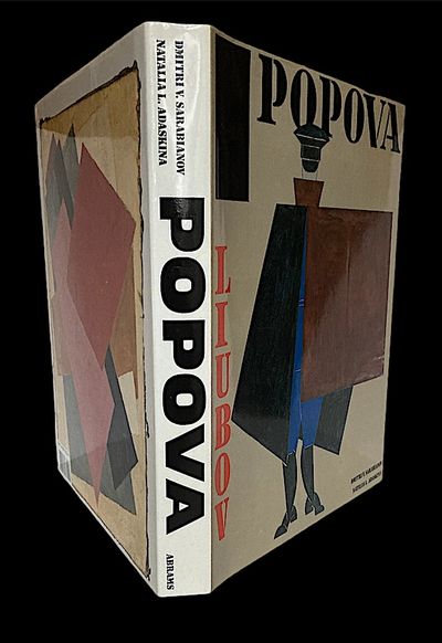
Harry N. Abrams, New York. 1990. 396 pages. Large 4to (31,5 x 26,5 cm). Fine in blue cloth in likewise dust jacket. 433 illustrations, including 133 plates in full colour. First American edition. Translated from Russian by Marian Schwartz.
Liubov Popova was one of the first female pioneers in Cubo-Futurism. Through a synthesis of styles she worked towards what she termed painterly architectonics. In 1916 she joined the Supremus group with Kazimir Malevich, the founder of Suprematism, Aleksandra Ekster, Ivan Kliun, Nadezhda Udaltsova, Olga Rozanova, Ivan Puni, Nina Genke, Ksenia Boguslavskaya and others who at this time worked in Verbovka Village Folk Centre. The creation of a new kind of painting was part of the revolutionary urge of the Russian avant-garde to remake the world. The term 'supreme' refers to a 'non-objective' or abstract world beyond that of everyday reality. As early as 1917, in parallel with her Suprematist work, the artist had made fabric designs and worked on Agitprop books and posters, In the Tenth State Exhibition: Non Objective Creativity and Suprematism, 1918, she contributed the architectonic series of paintings. She continued painting advanced abstract works until 1921. In the 5x5=25 Exhibition of 1921, Popova and her four fellow Constructivists declared that easel painting was to be abandoned and all creative work was to be for the people and the making of the new society. Popova worked in a broad range of mediums and disciplines, including painting, relief, works on paper, and designs for the theater, textiles, and typography.
More info
Antikvariat Morris
mor143
Helsingfors 1942. (14), 157 s. 4:o. Klotryggband med förgyllda blindpressningar på främre pärm. Rikt illustrerad. Inklistrat “gåvokort” från tryckeriet. Tryckt med anledning av det Frenckellska tryckeriets 300-års jubileum. Detta är ett ex av den svenska bibliofilutgåvan med ett faksimiltryck av titelsidan till J. C. Frenckells typprov av 1792. Tryckt i 600 numrerade exemplar varav detta är nr 348.
![Kalender [für das Jahr 1939] mit Gedichten von…](https://d3525k1ryd2155.cloudfront.net/h/399/273/1684273399.0.m.jpg)
Antikvariat Morris
mor1701
Gebr. Klingspor, Offenbach a. M. (2 blank), (27), 21, (1 colophon), (1 blank) pages. Small 8vo (16 x 10 cm). Card boards, front cover with drawing printed in colour. Corners bumped. The ”birth-signs” in the Zodiac by Willi Harwerth, printed in colour.
Printed at the Klingspor’s printing office in red and black in Rudolf Koch's Marathon on Zerkall-Bütten paper.
Antikvariat Morris
mor21263
Björck & Börjesson, Stockholm. 1915. 97 s. + kolofon. Trådhäftad med slitna omslag. Ryggen till omslagen saknas till större delen. Övre snitt putsat, övriga snitt oskurna. (30 x 23 cm). Privattryckt på handgjort papper i 100 subskriberade exemplar numrerade 1-100 samt 12 exemplar avsedda till arkiv och utgivare, signerade I-XII. Detta ex tillhör arkiv- & utgivarupplagan och bär nummer III.
Antikvariat Morris
mor5671
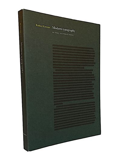
Hyphen Press, London. Reprinted with minor correction, 1994. 207 pages. Large 8vo. Sewn, flapped paperback, minor wear to cover. Black and white illustrations on glossy paper.
Situating the birth of modern typography around 1700, when it started to be distinct from printing, Robin Kinross introduces in Modern Typography a new understanding of the subject: as something larger and more deeply rooted than a modernism of style, echoing Jürgen Habermas’s proposition that modernity is ‘a continuing project’. Starting with the early years of the Enlightenment in France and Britain, different cultures and countries successively become the focus for the discussion as they gain significance. Examining the social, technical and material contexts in which typographers operate, the argument also considers principles and explanations of practice. This essay is seminal in many ways, providing a lively and critical narrative of historical development, a springboard for further investigation, and reproductions of not-often seen items.
‘This is a book to read and reread. It is provocative, dense, opinionated, and thoroughly original. […] It deserves to become a classic.’ Alastair Johnston, Bookways.
More info
Antikvariat Morris
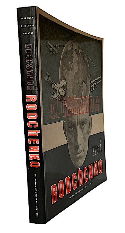
mor5726
The Museum of Modern Art, New York. 1998. First edition. 336 pages. 4to (29,5 x 24,5 cm). Stiff, printed wrappers. 431 illustrations (221 colour, 114 duotone). With essays by Aleksandr Lavrent’ev and Varvara Rodchenko.
The catalogue presents for the first time a full and coherent overview of Rodchenko’s diverse achievement. An illustrated chronology outlines the story of the artist’s life.
Aleksander Mikhailovich Rodchenko (5 December 1891–3 December 1956) was a Russian and Soviet artist, sculptor, photographer, and graphic designer. He was one of the founders of constructivism and Russian design; he was married to the artist Varvara Stepanova.
Rodchenko was one of the most versatile constructivist and productivist artists to emerge after the Russian Revolution. He worked as a painter and graphic designer before turning to photomontage and photography. His photography was socially engaged, formally innovative, and opposed to a painterly aesthetic. Concerned with the need for analytical-documentary photo series, he often shot his subjects from odd angles—usually high above or down below—to shock the viewer and to postpone recognition. He wrote: "One has to take several different shots of a subject, from different points of view and in different situations, as if one examined it in the round rather than looked through the same key-hole again and again."
More info
Antikvariat Morris
mor24403
Svenska Teknologföreningens afdelning för husbyggnadskonst, Stockholm. 1908-30. Del 1: Text och register till hela verket. Del 2: Planscher Götaland. Del 3: Planscher Svealand och Norrland. Sammanlagt c. 1500 sidor. Illustrerade med c. 800 dokumenterade fotografier, planritningar och teckningar. Illustrerade i texten med med äldre stadsvyer, stadskartor och planer. (28 x 22 cm). Mörkblåa skinnband med ryggtitlar i guld och gulddekorerade pärmar, övre guldsnitt. Ena bandet med något nött och blek rygg, skadad vid ryggfoten hörnstött. Det andra bandet skadat vid ryggfoten och liten skinnförlust, pärmkanterna nötta. Tre delar i två volymer. Praktupplagan tryckt för namngiven ägare.
More info
Antikvariat Morris
mor5207
Lunds Konsthall. 1982. Screentryckt affisch. (70 x 100 cm). Formgiven av Gert Fors & John Melin. (Se John Melin till exempel s. 59, spektakulär katalog!).
Antikvariat Morris
mor1780
The Pioneer Associates, New York. 1935. xx, 172 s. + 19 planscher med Timothy Cole’s bästa trägravyrer. Stor 8:o. Havsblå klotband med guldtryckt ryggtitel och förgylld främre pärm. Endast övre snitt skuret. Tillskrift på smutstitelsidan från William T. Dewart. William T. Dewart var ägare av New York Evening Sun och Timothy Cole graverade både Mr. och Mrs. Dewart’s porträtt. Frontplanschen föreställer Timothy Cole under arbete med Mrs. Dewart’s gravyrporträtt.
Formgiven av D. B. Updike och tryckt med Monotype Caslon vid The Merrymount Press i 750 numrerade ex varav detta är nr 91 och signerade av författarna. (Smith 786).
More info
Antikvariat Morris
mor24167
Kejserliga Senatens tryckeri, Helsingfors. 1867. (1), 46 s. + 1 plansch. Stor 8:o (24,5 x 19,5 cm). Häftad med blå ryggremsa. Yttre hörnen med vikmärken. Planschen, med två figurer, har en lång reva och pappersförlust vid övre och nedre marginalen, bildytorna berörs dock inte. Det tunna planschpappret är också "skrynklat". En enkel figur i texten. Namnteckning på omslaget Edvard Åberg, alltså Johans son och far till poeten Gunnar Björling.
Antikvariat Morris
mor1969
F. Tilgmann, Helsingfors 1931. 66 s. + 73 planscher varav en del i färg. Liten folio. Halvklotband med blindpressad pärmstämpel efter en teckning av Albert Edelfelt. Tryckt för namngiven ägare (Martha Lundholm) i en numrerad upplaga om 1500 ex. Detta exemplar är nr 1085.
Utomordentligt tryck av titelsidor, bokuppslag och illustrationer.
Antikvariat Morris
mor2756
The Lion and Unicorn Press, London 1961. 175, (1) s. 4:o (28,5x21,5 cm). Skinnryggband, fläck på ryggens nedre del, främre pärm dekorerat med rött sigill. Planschillustrerad. Tryckt i 400 numrerade ex, detta är nr 35.
Antikvariat Morris
mor3306
Faber and Faber, London 1958. 448 s. 4:o (28x20 cm). Klotband med trasigt skyddsomslag. Med över 400 illustrationer, därav 20 i färg. Med bibliografi och index.
En omfattande historisk redogörelse om bokens illustrering.