Antikvariat.net and affiliated stores.
Payment terms:
This site accepts online payments from all major payment card providers. For certain transactions, either wallet solutions (Google or Apple wallets) or mobile payment solutions can also be used. This will be stated at checkout, where the site determines which payment options can be used.
When you order on the site and pay online, the amount of your purchase will only be debited from your card when the item is shipped from the store(s) you purchased from. If you buy books from more than one store, each store will only debit the amount you purchased from them, so that the total purchase amount is only finally debited when all stores have shipped the items to you. Should a book be sold out, or if there are other reasons why parts of the order cannot be processed, the purchase amount for the store(s) where this occurs will be reduced accordingly, so that you only pay for the items that are shipped to you. The remaining amount will be returned to your card automatically.
You can also order via invoice agreement; however, this is primarily reserved for institutional or professional traders. Finally, you can place an order for personal collection. However, you should be very aware that the antiquarians on this site are spread across Scandinavia, so check whether it will be possible for you to physically collect your orders.
All orders are accepted with the reservation that the book may have faulty descriptions, and already can be sold.
All used books are sold according to the special rules for used VAT, which is not deductible. When concluding a purchase agreement between you and the affiliated shops, you should be aware that almost all goods sold via antikvariat.net are used books, cards or prints, and you as a customer cannot therefore expect that the goods you buy are like new, however: when an antiquariate writes 'almost like new', it is close.
Some antiquarians sell brand new books to a limited extent, which will be designated 'not used books' or similar. The condition will be described as the individual item; therefore it is assumed that you as a customer have informed yourself about this when concluding the purchase.
When you order goods through antikvariat.net, it is always the individual antiquarians that are associated with the site you are shopping with, not antikvariat.net. Also, when it comes to payments, payment takes place directly between you and the stores you choose to buy books from, through this page.
antikvariat.net only mediates the contact between you as a customer and the members of the antiquarian booksellers' associations in Denmark, Norway and Sweden who are registered with this web shop. On antikvariat.net you can see a complete payment overview, also when purchasing from several affiliated stores. The amount to be paid goes to each antiquarian bookshop and takes place directly between you and the stores you shop with, and not through this site. All prices are displayed in the currency you have chosen and are incl. VAT. All prices are converted daily based on the rates of the European Central Bank.
Delivery terms:
The participating stores use different suppliers for shipping; you can see which ones when you inspect your order in the shopping cart and proceed to payment. Orders to be sent by post will be charged the current postage rate.
We have basically calculated the shipping price based on this criterion: A 2 kilo shipment as a regular letter, without insurance. If you want to secure your shipment and get Track and Trace (Tracking code), you must make the antiquarian aware of this after purchase.
Since we cannot provide the exact price for any given delivery in advance, due to large differences in the weight of the books, the postage fee may be adjusted when your order is finally calculated.
You will be informed of this in a separate message that sets the final purchase price incl. all expenses. For orders collected in store, there is no additional surcharge other than the price of the book. If a different shipping method is desired than the one chosen by the stores, it is at the customer's own expense, for the part that exceeds the regular postage rates. You will receive a payment request for additional shipping costs, and only once this has been accepted by you will the order be shipped. If you refuse to pay the extra, the entire order will be canceled.
If the customer provides an incorrect address when placing the order, the customer is solely responsible for the additional costs associated with any additional shipping of the ordered item, and it is the customer's own responsibility if the ordered order is lost as a result of an incorrect address provided by the customer. The delivery time is normally 1-5 business days, but the delivery time may vary if an ordered item is in a remote warehouse.
Right of withdrawal:
The withdrawal period is 14 days. The period is calculated as a starting point from the day you have received the item. According to the Danish Consumer Contracts Act, you are entitled to receive a set of informations, including the right of withdrawal and the ordered service. The withdrawal period does not run until you have received this information in writing (e.g. in an order confirmation on paper or by e-mail).
For example, If you place your order on Monday the 1st and have also received the aforementioned information, you have until Monday the 15th. If you have only received the information later, for example Wednesday the 3rd, you have until Wednesday the 17th. If the deadline expires on a public holiday, Saturday, Constitution Day, Christmas Eve or New Year's Eve, you can wait until the following weekday.
If you cancel your purchase within the statutory period of 14 days, you then have an additional 14 days before the item must be sent back to the store you purchased it from. In the event of cancellation, the item must be in substantially the same condition as when it was sent to you in order for you to receive a full refund of the purchase price. By substantially the same condition is meant the condition that you would be in if you saw the item in a physical store, after you had physically inspected the item. It is permissible to view the image on a TV set, hear the sound on a radio receiver, try on a dress, etc. and still be able to return the item without deduction from the purchase price.
However, it is not permitted to use a TV set for a long time, go to a party with the dress, or other prolonged use, without incurring liability for deterioration of the item. The same applies to books and cards, and it will be up to the discretion of the stores involved whether an item has lost so much of its sales value that a deduction must be made from the amount refunded to the customer.
When returning an item due to cancellation of the purchase, the customer always bears the full cost of the costs resulting from the return, without exception.
When an item is ordered online for collection in a store, and payment is only made when the item is collected in a physical store, the 14-day right of return lapses, as the transaction is considered a physical transaction that is not covered by the provisions of the Danish Sales Act on online shopping.
How do you cancel an order?
Before the end of the withdrawal period, you must notify the store that you have withdrawn from the agreement. If you want to give this notification in writing – e.g. by letter or e-mail – you must simply send the notification before the end of the period. If you want to ensure proof that you have withdrawn in good time, you can, for example, send the letter by registered mail and keep the postal receipt. You can use this link for further information: Form
Right of complaint:
According to the Danish Sales of Goods Act, you always have a 24-month right of complaint for a product, even if it has been used. This means that you can complain about errors or defects in the purchased product 24 months after purchasing your product, provided that these errors and defects are not caused by improper use or other harmful behavior on your part. If you want to invoke the right to complain, it must take place within a reasonable time after the error or defect has been discovered.
Complaints submitted within 2 months of the discovery of defects or deficiencies are always considered to have been submitted in a timely manner. However, it is always difficult to determine whether a complaint can be justified under the Danish Sales Act. If, in connection with the purchase, you are made aware of the defects and deficiencies in the item you are about to purchase, you cannot later invoke these defects as a valid reason for wanting either to cancel the purchase or demand repair of the item. If, on the other hand, you have not been informed of the defects or deficiencies, or if the seller has not stipulated that the item is purchased as-is, there may be a valid reason for either exchanging, repairing or canceling the transaction. After submitting the complaint and agreement has been reached that the complaint is justified, the store involved will pay reasonable shipping costs that you must incur to return the item to them. The stores reserve the right to assess the defect or deficiency that has occurred and offer either a refund, a price reduction or an exchange. If a complaint is made within 24 months and the same fault occurs again, you as a customer have an additional 2 years’ right of complaint from the time of the complaint, provided it is the same fault. If a different fault occurs than the one you have already complained about once, and more than 24 months have passed from the time of purchase, your right of complaint lapses.
Information on options for complaint:
A complaint about a product or service purchased from one of our members must first be submitted to the store(s) from which the goods were ordered. Therefore, first contact the antiquarian bookshop(s) in question and submit your complaint to them. If an agreement cannot be reached on the complaint and you believe that you have not been treated correctly, you must complain to the site administrator (write to: admin@antikvariat.net), who will forward the complaint to the association to which the member you wish to complain about belongs. If there is still a dispute after this instance, a complaint can be submitted to the Competition and Consumer Authority's Center for Complaints Resolution, in the country where you reside.
When submitting a complaint, you must provide the store's email address and send it to this email address: http://ec.europa.eu/odr
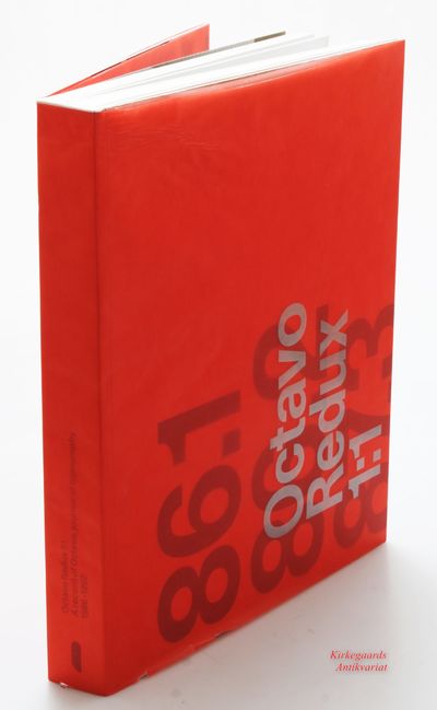
![Supernew Supergraphics [SUPER GRAPHICS Unit 16]. (photo 1)](https://d3525k1ryd2155.cloudfront.net/h/659/721/1703721659.0.l.jpg)


![Studio Culture Now [Unit 45]. Advice and guidance…](https://d3525k1ryd2155.cloudfront.net/h/657/721/1703721657.0.l.jpg)
